DESIGN A CORPORATE LOGO FOR AN AUSTRALIAN ONLINE BOOKKEEPING START UP COMPANY
- Statusi: Closed
- Çmimi: $75
- Kandidaturat e marra: 25
- Fituesi: RBM777

Përmbledhja e konkursit
1
PROJECT TITLE
DESIGN A CORPORATE LOGO FOR AN AUSTRALIAN ONLINE BOOKKEEPING START UP COMPANY
2
SKILLS REQUIRED
LOGO DESIGN, GRAPHIC DESIGN
3
PROJECT DESCRIPTION
A LOGO IS REQUIRED FOR AN AUSTRALIAN ONLINE BOOKKEEPING START UP COMPANY.
THE OUTPUT REQUIRED IS A LOGO THAT CAN BE USED IN A VARIETY OF FORMATS SUCH AS:
(A) COMPANY WEBSITE
(B) COMPANY STATIONARY (SUCH AS INVOICES)
(C) NEWSPAPER ADVERTISEMENTS
4
CONTEST DURATION
14 DAYS
5
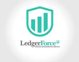
BUSINESS NAME
LEDGER FORCE
6
URL OF WEBSITE ADDRESS
www.ledgerforce.com.au
7
NAME ON LOGO
LEDGER FORCE
8
DESCRIBE WHAT YOUR SERVICE DOES
Ledger Force is the online bookkeeping service that provides audit proof financial statements from professional accountants.
9
DESCRIBE WHAT IS THE TARGET AUDIENCE OF YOUR SERVICE
Small Australian businesses and organisations with expenses of less than $75,000 per month.
10
WEBSITE VISITOR / BUYER PROFILE
Business owners, Personal Assistants of business owners, People who manage the bookkeeping at a business/organisation
11
TARGET INDUSTRIES / SECTORS
Niche markets to target not yet fully decided upon.
12
SELECT YOUR INDUSTRY
ACCOUNTING & FINANCIAL / PROFESSIONAL SERVICES / BOOKKEEPING / ACCOUNTING / SERVICE INDUSTRY / B2B /
13
MISSION / OBJECTIVES OF THE LOGO
To create a corporate logo that is similar in standard, if not better than, the quality of the logo of Bench Accounting ( www.bench.co )
14
PREFERRED COLOUR(S) SCHEME
THE DESIGNERS HAVE FULL POWER TO DECIDE ON THIS.
15
FONTS
THE DESIGNERS HAVE FULL POWER TO DECIDE ON THIS.
16
PREFERRED LOGO STYLE
THE DESIGNERS HAVE FULL POWER TO DECIDE ON THIS. HOWEVER, IT IS CURRENTLY OUR INTENTION TO CREATE A LOGO STYLE AND WEBSITE THAT IS SIMILAR TO WWW.BENCH.CO BECAUSE WE KNOW THEIR BUSINESS MODEL IS A GOOD ONE AND WE ARE RELUCTANT TO DEVIATE TOO MUCH FROM THEIR DESIGN STYLE BECAUSE WE KNOW THAT WHAT THEY ARE DOING IS WORKING.
SO, IN CREATING A LOGO THAT IS SIMILAR IN STYLE TO BENCH IT MAY BE THAT A LOGO WHICH INCLUDES THE FOLLOWING MAY BE THE BEST FOR US:
A LOGO WORD MARK (ie. LEDGER FORCE IN A STYLISED TYPE/FONT BECOMES THE LOGO).
PLUS ONE OF THE FOLLOWING 2 OPTIONS:
A PICTORIAL MARK, IMAGE OR SHAPE USED TO REPRESENT LEDGERFORCE.
OR
AN ABSTRACT SHAPE OR SYMBOL USED TO CONVEY THE VALUES OF LEDGERFORCE.
17
LOGOS TO LOOK AT FOR IDEAS AND GUIDANCE & INSPIRATION & WHAT DO YOU LIKE ABOUT EACH OF THESE LOGOS?
1. WWW.BENCH.CO (WE GREATLY RESPECT THIS COMPANY AND WANT TO BE LIKE THEM)
18
IS THERE ANYTHING ELSE YOU WOULD LIKE TO COMMUNICATE TO THE DESIGNERS?
IF YOU HAVE ANY QUESTIONS, FEEL FREE TO MESSAGE ME AND I WILL TRY TO RESPOND AS QUICKLY AS I CAN.
19
IS THERE ANYTHING THAT SHOULD BE AVOIDED?
I THINK IF THE LOGO STYLE IS TOO DIFFERENT FROM THE STYLE OF BENCH''S LOGO I AM NOT SURE WE WILL BE ABLE TO CHOOSE SUCH A DESIGN.
Aftësi të rekomanduara
Vlerёsimi i punёdhёnёsit
“RBM777 is top quality. Very easy to deal with. Very fast communicator. Did some great logo designs for this contest. Also, provided a lot of revisions too. Fully recommend RBM777! A++.”
![]() garyjames, Australia.
garyjames, Australia.
Këndi publik i sqarimeve
-

RBM777
- 9 vite më parë
hi gary, i have comment, pls check on number 26. thanks
- 9 vite më parë
-

Krijuesi i Konkursit - 9 vite më parë
Hi rbm777, I have sent you a pm via design number 26. Kind regards, Gary.
- 9 vite më parë
-
Krijuesi i Konkursit - 9 vite më parë
Hi rbm777, I have sent you a pm via design number 26. Kind regards, Gary.
- 9 vite më parë
-
RBM777
- 9 vite më parë
thanks gary...
- 9 vite më parë
-
Krijuesi i Konkursit - 9 vite më parë
Hi RBM777, 43 people have participated in the poll. I will give it 6 more hours then decide. You are currently in 1st and 2nd position. I will send you a PM this evening. Kind Regards, Gary.
- 9 vite më parë
-
RBM777
- 9 vite më parë
hi gary , any update. thanks
- 9 vite më parë
-
RBM777
- 9 vite më parë
hi gary , how are you?
- 9 vite më parë
-
RBM777
- 9 vite më parë
thanks gary...
- 9 vite më parë
-
Krijuesi i Konkursit - 9 vite më parë
Hi RBM777, Things are fine. I am just waiting for the contest to end. At the moment you are leading the contest. You are the only one with a design rated 5 stars. I might do a poll in a day or so to get a 2nd opinion from a few friends & associates, but I think they will probably choose your designs as the best. Kind Regards, Gary.
- 9 vite më parë
-
RBM777
- 9 vite më parë
hi gary, any update :)
- 9 vite më parë
-
RBM777
- 9 vite më parë
hi gary, how are you?
- 9 vite më parë
-
Krijuesi i Konkursit - 9 vite më parë
Hi RBM777, I have just sent you a PM for both 29 and 30. Kind Regards, Gary
- 9 vite më parë
-
RBM777
- 9 vite më parë
hi gary, #30 please. thanks
- 9 vite më parë
-
RBM777
- 9 vite më parë
hi gary, #29 please. thanks
- 9 vite më parë
-
Krijuesi i Konkursit - 9 vite më parë
6. For those wanting to work out the exact font of the Bench logo...try having a look at the following url: https://bench.co/press/
- 9 vite më parë
-
Krijuesi i Konkursit - 9 vite më parë
5. A brown shield is still probably the best. I have seen nice shades of red and blue but I am worried that these are too far from the logo colour of Bench. I am open to persuasion on this but deep down I think the winning logo design will be the one that uses the colour brown like in the www.bench.co logo.
- 9 vite më parë
-
Krijuesi i Konkursit - 9 vite më parë
4. Not 100% fully decided on what is the best mark, image, symbol, shape inside the shield...but one designer has come up with an idea that looks very good...and it looks like a bar chart with 3 bars...but other designers can come up with other ideas if they wish.
- 9 vite më parë
-
Krijuesi i Konkursit - 9 vite më parë
3. Marks, Images, Symbols, Shapes that are a shield like Bench's are the best.
- 9 vite më parë
-
Krijuesi i Konkursit - 9 vite më parë
2. Fonts that are exactly same as Bench's are the best.
- 9 vite më parë
-
Krijuesi i Konkursit - 9 vite më parë
1. If designers stick to these 4 scenarios when presenting their designs that will be great.
- 9 vite më parë
-
Krijuesi i Konkursit - 9 vite më parë
1.(iv) White font and a brown shield.
- 9 vite më parë
-
Krijuesi i Konkursit - 9 vite më parë
1.(iii). Black font and a brown shield.
- 9 vite më parë
-
Krijuesi i Konkursit - 9 vite më parë
1.(ii) All white font and all white shield.
- 9 vite më parë
-
Krijuesi i Konkursit - 9 vite më parë
1(i) All black font and all black shield.
- 9 vite më parë
-
Krijuesi i Konkursit - 9 vite më parë
1. If you visit the www.bench.co website you will see that they use their logo in 4 different scenarios, namely:
- 9 vite më parë
-
Krijuesi i Konkursit - 9 vite më parë
Hi all, Here is some more feedback with 6 days remaining...I think the following feedback can help designers produce designs which have a better chance of winning the contest. Any questions on this feedback, please feel free to post a message and I will try to respond as quickly as I can. Kind Regards, Gary.
- 9 vite më parë
-
Krijuesi i Konkursit - 9 vite më parë
Hi IntenseART, I have just sent you a PM regarding #27 and #28 . Kind Regards, Gary.
- 9 vite më parë
-
Krijuesi i Konkursit - 9 vite më parë
Hi RBM777, Have just sent you a PM regarding #25 .
- 9 vite më parë
-

IntenseART
- 9 vite më parë
Please review #27 and #28 . Regards
- 9 vite më parë
-
RBM777
- 9 vite më parë
hi gary #25 please, changes done as per feedback. thanks
- 9 vite më parë
-
Krijuesi i Konkursit - 9 vite më parë
3. In regards to colour the best colours seem to be as follows: all white font and mark, or all black font and mark or all light brown/beige. Some designers have used the colour red which looks appealing. Some designers have used the colour light blue which also looks good. These 5 colours seem to be the best.
- 9 vite më parë
-
Krijuesi i Konkursit - 9 vite më parë
2. Those with a mark, image, shape or symbol contained in a small shield are preferred.
- 9 vite më parë
-
Krijuesi i Konkursit - 9 vite më parë
1. Font types which are identical to, or very very similar to, the font type logo of Bench (www.bench.co) are preferred.
- 9 vite më parë
-
Krijuesi i Konkursit - 9 vite më parë
With 8 days remaining, I thought it might be helpful to provide some general feedback based on the designs seen so far...hope the following feedback points are helpful:
- 9 vite më parë
-
Krijuesi i Konkursit - 9 vite më parë
But maybe for some logo designers with lots of good resources at their finger tips it could be a piece of cake?
- 9 vite më parë
-
Krijuesi i Konkursit - 9 vite më parë
I just noticed I didn't answer 1 of your questions: in short, it should be corporate. But having said that, I think it will require a whole lot of creative thinking - or extensive knowledge of marks, images, shapes and symbols - to be able to come up with a suitable mark, image, shape or symbol for this logo contest in my view anyway.
- 9 vite më parë
-
Krijuesi i Konkursit - 9 vite më parë
If you have any more questions, or anybody else does, feel free to ask. I will try to reply as quickly as I can.
- 9 vite më parë
-
Krijuesi i Konkursit - 9 vite më parë
Hope the feeback helps you siddigiace.
- 9 vite më parë
-
Krijuesi i Konkursit - 9 vite më parë
The reason why the logo designs should be shown in 3 different ways is because in the bench.co website this is how they show their logo...depending on the background colour of each page on their website. (If you visit www.bench.co you will see what I mean...By the way...this isn't a misprint...the website address is just: www.bench.co - not .com or .co.uk or anything...just .co)
- 9 vite më parë
-
Krijuesi i Konkursit - 9 vite më parë
In terms of colours, I think a good approach is to do the text / font / type in black against a white or light background...and a version in white against a black or dark background. The mark, image, shape or symbol should probably be shown in 3 ways, namely: in black, in white, and in the chosen colour (eg. beige or whatever colour the designer thinks could work...but from what I have seen of designs so far, the ones where the mark, image, shape or symbol is beige looks pretty neat.
- 9 vite më parë
-
Krijuesi i Konkursit - 9 vite më parë
The logo should be similar in style to bench.co logo...namely: Ledger Force in text / font / type (preferably similar to or exactly the same as the Bench font type) - as this seems to be the best approach that I have seen so far in the contest. Then a mark, image, symbol or shape at the end of the text...like in the bench logo where they have a shield with a profit symbol inside the shield. I really don't know what the mark, image, symbol or shape should be. This, I think, is where the challenge lies with this logo contest. As regards to placing the mark, image, symbol or shape within a shield, that could work...some designs so far have used a shield and it looks neat.
- 9 vite më parë
-
Krijuesi i Konkursit - 9 vite më parë
Name of company: Ledger Force
- 9 vite më parë
-

siddigiace
- 9 vite më parë
You can share that in the PCB Will be waiting
- 9 vite më parë
-
Krijuesi i Konkursit - 9 vite më parë
Hi Siddigiace, Did you find the answers? If not, let me know and I will type the answers here in the Public Clarification Board. Kind Regards, Gary.
- 9 vite më parë
-
Krijuesi i Konkursit - 9 vite më parë
Hi Siddigiace, The answers to your 3 questions are all contained in the design brief. Kind Regards, Gary.
- 9 vite më parë
-
siddigiace
- 9 vite më parë
Or a blend of both ??
- 9 vite më parë
-
siddigiace
- 9 vite më parë
Any Specific requirement regarding it such as logo in text or in creative image or completely corporate..
- 9 vite më parë
-
siddigiace
- 9 vite më parë
HI Greetings For The Day, May I Know the name of your company. ???
- 9 vite më parë
Si të fillosh me konkurset
-

Posto konkursin Shpejt dhe thjeshtë
-

Merr shumë propozime Nga e gjithë bota
-

Zgjidh kandidaturën më të mirë Shkarko dokumentet - E thjeshtë!