Design a Logo & Icon for SoftwareHawk

  • Statusi: Closed
  • Çmimi: $20
  • Kandidaturat e marra: 87
  • Fituesi: shakilhd99

Përmbledhja e konkursit

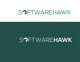
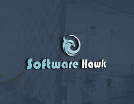
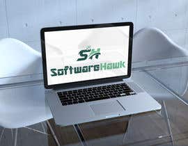
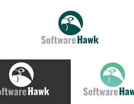
Hello, we are launching a new software comparison site called "SoftwareHawk" and need a logo. We like clean, clever, easily printable logos that will look nice when listed on a website, business card, etc. and that could also be shortened (removing the words) to just be an image icon for the brand. Our color palette is attached below but please note that #000000 is also part of our palette. Gradients are OK. You have the option to include a hawk or not include a hawk. We are pretty open to different design styles as long as they fit the "clean" and easily printable requirements.

We would like the following file types:
.png
.gif
.jpg
.eps
.ai
.pdf

Please note that the winning logo would be considered the property of WorkFinch, Inc. and used for SoftwareHawk promotions etc.

Aftësi të rekomanduara

Vlerёsimi i punёdhёnёsit

“Md Shakil A. created a great logo for our company!”

Fotoja e profilit juliescotland, United States.

Punimet mё tё mira nga ky konkurs

Shiko mё shumё vepra

Këndi publik i sqarimeve

  • juliescotland
    Krijuesi i Konkursit
    • 5 vite më parë

    Hi All, we are really starting to hone in on the logos that have a nice circular hawk image either on the side or above the "SoftwareHawk" copy - we have a little less than a day left in the contest if you have any more submissions or versions you'd like to submit. Thanks!!

    • 5 vite më parë
  • FreelancerSagor5
    FreelancerSagor5
    • 5 vite më parë

    #106

    • 5 vite më parë
  • sarmintohfa
    sarmintohfa
    • 5 vite më parë

    Thanks for the feedback. Please check Entry #100 .

    • 5 vite më parë
  • juliescotland
    Krijuesi i Konkursit
    • 5 vite më parë

    Thanks all - we are really loving the logos that people are sending in. Would love to see some using blue/green gradient coloring (like the gradient coloring in submission #49 ). We are just trying to wrap our head around many different styles etc to see what we think will be the right fit. We've been really impressed with a lot of the designs!

    • 5 vite më parë
  • sarmintohfa
    sarmintohfa
    • 5 vite më parë

    Please check Entry #88 . Thanks.

    • 5 vite më parë
  • DiligentAsad
    DiligentAsad
    • 5 vite më parë

    Also check Entry #83

    • 5 vite më parë
  • FreelancerSagor5
    FreelancerSagor5
    • 5 vite më parë

    #79 #80

    • 5 vite më parë
  • DiligentAsad
    DiligentAsad
    • 5 vite më parë

    Thanks.. Now Check Please Entry #68 , #69 , #70 , #71 . Thanks.

    • 5 vite më parë
  • DiligentAsad
    DiligentAsad
    • 5 vite më parë

    Dear Ch, Now Check Please entry #62 , #63 . Thanks..

    • 5 vite më parë
  • juliescotland
    Krijuesi i Konkursit
    • 5 vite më parë

    Earlier we wrote that we liked having either all lowercase or just "S" and "H" capitalized. After seeing submission #18 we would also consider all capitalization in the logo if the words are distinctive from each other like in that example.

    • 5 vite më parë
  • lailitdelcarmeng
    lailitdelcarmeng
    • 5 vite më parë

    Hi, please check # 50

    • 5 vite më parë
    1. juliescotland
      Krijuesi i Konkursit
      • 5 vite më parë

      Hi Lailit, we really like the simplicity of this and the distinction between the two words. We like how clean the icon is in the logo but we all first saw a bull before we could see the hawk face. Is there another hawk icon you could replace with? Thanks!

      • 5 vite më parë
  • makolzuhaib1
    makolzuhaib1
    • 5 vite më parë

    #41 #39

    • 5 vite më parë
  • juliescotland
    Krijuesi i Konkursit
    • 5 vite më parë

    @motiur thank you for your submission, we like the simplicity of the logo and the font style you used but the bird is a swan. do you have a hawk image you could try there instead?

    • 5 vite më parë
  • juliescotland
    Krijuesi i Konkursit
    • 5 vite më parë

    @motalleb I really like the circle around the hawk face with your #28 submission. is there a way to simplify the hawk even more within the circle? and maybe try placing it to the left of the logo in line with it?

    • 5 vite më parë
  • juliescotland
    Krijuesi i Konkursit
    • 5 vite më parë

    Thanks for your submission Ahmed, we like the image being encompassed by a circle but we think it is a little too cartoonish.

    • 5 vite më parë
  • sadikuls874
    sadikuls874
    • 5 vite më parë

    #22 #25 #27

    • 5 vite më parë
  • juliescotland
    Krijuesi i Konkursit
    • 5 vite më parë

    Ibqal we really like your font style and the simplicity of having a bird image above it . . . can you do something similar with a more fluid / smooth bird rather than a squared one?

    • 5 vite më parë
  • juliescotland
    Krijuesi i Konkursit
    • 5 vite më parë

    Md Shakil A, thank you for your submission - we really like the font style on your logo design. The colors switching so often on the letters is too busy for what we are looking for but we like this from a more simplistic standpoint (solid colors on letters)

    • 5 vite më parë
  • juliescotland
    Krijuesi i Konkursit
    • 5 vite më parë

    @motalleb the "SoftwareHawk" font style in your #11 submission is our favorite so far. We still think the image is too big next to the copy though.

    • 5 vite më parë
  • juliescotland
    Krijuesi i Konkursit
    • 5 vite më parë

    Thank you Hamida, we really like the color gradients and contrasts in your logo submission!

    • 5 vite më parë
    1. Hamidaakbar
      Hamidaakbar
      • 5 vite më parë

      Thanks sir

      • 5 vite më parë
  • juliescotland
    Krijuesi i Konkursit
    • 5 vite më parë

    Hi Motiur, thank you for your submission we like the capitalization and distinction between "SoftwareHawk" ~ this is a nice simple design.

    • 5 vite më parë
  • juliescotland
    Krijuesi i Konkursit
    • 5 vite më parë

    Thanks for the submission Motalleb, we like the incorporation of a hawk in the logo. After seeing the letters in all caps I think we prefer either all lowercase or just the "S" and "H" capitalized. Also, I think we like an image that isn't quite so much larger than the words.

    • 5 vite më parë
  • juliescotland
    Krijuesi i Konkursit
    • 5 vite më parë

    Also, we like the simplicity of these designs but are not quite sure how the symbols tie into the company name/what it does.

    • 5 vite më parë
  • juliescotland
    Krijuesi i Konkursit
    • 5 vite më parë

    Hi Sadikul, thank you for your entries. The company is called "SoftwareHawk" so looking for a logo that would have the full "SoftwareHawk" included.

    • 5 vite më parë
  • sadikuls874
    sadikuls874
    • 5 vite më parë

    #2 #3

    • 5 vite më parë
  • sadikuls874
    sadikuls874
    • 5 vite më parë

    #1

    • 5 vite më parë

Shfaq më shumë komente

Si të fillosh me konkurset

  • Posto konkursin

    Posto konkursin Shpejt dhe thjeshtë

  • Merr shumë propozime

    Merr shumë propozime Nga e gjithë bota

  • Zgjidh kandidaturën më të mirë

    Zgjidh kandidaturën më të mirë Shkarko dokumentet - E thjeshtë!

Postoni një konkurs tani! ose bashkohu me ne sot!