Freelancer: anamgaina
Shpërndani:
Raportoni kandidaturën

the better logo

Hi there, The logo incorporates soft natural shapes cradling the diamond. The repetition of identical shapes makes the diamond stand out asa a distinguished, better shape. Hope you like it. Please contact me if you want any changes made.
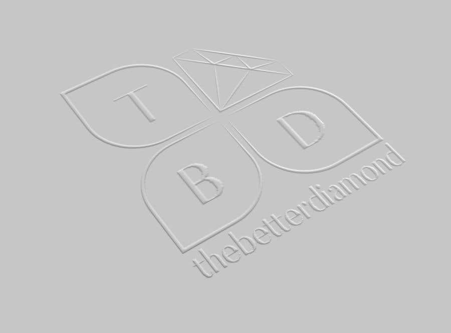
Kandidatura #227për                                                 Design a Logo
Kandidatura #227

Këndi publik i sqarimeve

  • jonathanchoy
    Krijuesi i Konkursit
    • 5 vite më parë

    We hope the design can move into the direction where it is a mix of all the below concepts. A logo to symbolise growth, sustainability and diamonds. Diamond shape should also be soft and fully connected together (fengshui consideration... sharp and broken logos are not good in asia)
    Hi guys, excellent posts! My partners and I have compiled a list of the following great designs:
    227
    237
    239
    240/199 - Excellent!
    210

    • 5 vite më parë
    1. anamgaina
      anamgaina
      • 5 vite më parë

      Hello, I've resubmitted the modified logo. It's entry #271 .

      • 5 vite më parë