REVELATION Branding
nga WeAreAlba
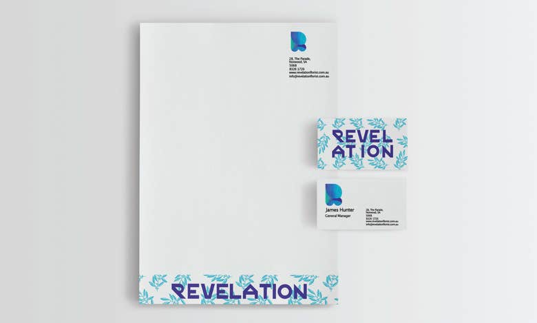
The final logo design mimics a leaf opening up incorporating the literal meaning of revelation. The organic representation of the “R” metaphorically represents the organic products sold by Revelation. The subtle colour changes inside the “R” represent the stained-glass windows of the church next-door.

Rreth meje
I'm a freelance designer operating out of Adelaide, Australia, catering to the visual and textual needs of individuals and organisations both domestically and internationally. I work collaboratively and constructively with my clients to provide high quality branding that outlines your company's key goals and attributes.